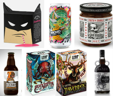
Tempt Cider

(images via: the dieline)
Dazzling illustrations of dragonflies, jewels, bird cages and partially nude figures will certainly tempt you to pick up a can or bottle of this cider, designed by Danish brand DDB Denmark, to take a closer look.“The concept is build on the that cider keeps a secret,” the designers say. “You can not smell or taste it but cider is an alchohol. You get tempted by the innocent look, the fruity smell and the refreshing taste. You are too couriuos to avoid a sip and suddenly it´s you that have a secret. Therefore the cider got the name Tempt.
The design is characterised by the innocent look at the first glance but by looking closer you will find small secrets and hidden details.”
Bold City Brewery by Kendrick Kidd
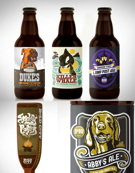
(images via: kendrick kidd)
All of the packaging for Bold City Brewery of Jacksonville, Florida is ultra-colorful and attention-grabbing thanks to the artistry of designer Kendrick Kidd. From the labels on the bottles to the tap handles. Each type of beer gets an appropriate illustration, like the adorable dog on Duke’s Brown Ale and a campfire on the Smokey Porter.Milk Cocktail by Studio Hattomonkey
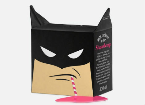
(images via: coroflot)
Who could resist picking up a box of strawberry milk – even if you don’t like strawberry milk – when it looks like this? Russian design firm Studio Hattomonkey uses the image of a well-known superhero to make this conceptual packaging stand out.Leap Organics by Moxie Sozo and Charles Bloom
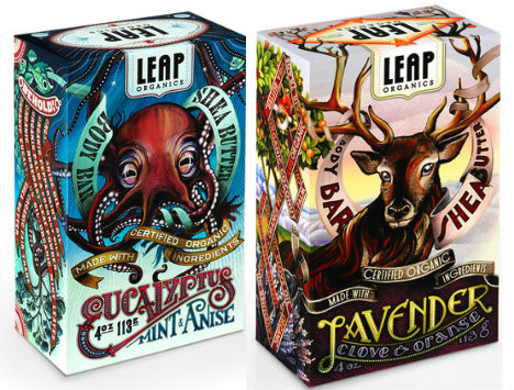
(image via: lovelypackage)
Lush imagery evoking the wild, natural sources of scents like lavender, clove, eucalyptus and anise adorn the outside of these soap wrappers, designed by Moxie Sozo and illustrated by Charles Bloom for organic soap company Leap Organics.INQ Mobile by Alberto Cerriteno
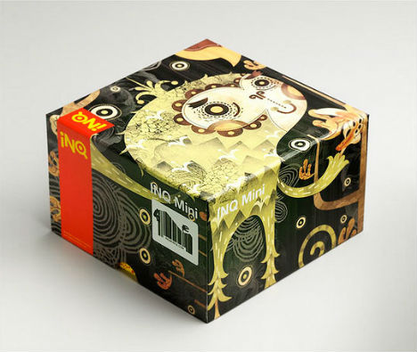
(images vía: alberto cerriteno)
Artist Alberto Cerriteno lent his highly distinctive style to packaging for INQ Mobile, resulting in a box that looks absolutely unlike anything you’ve ever seen at a cell phone shop.The Quest Wine by Studio Lost & Found
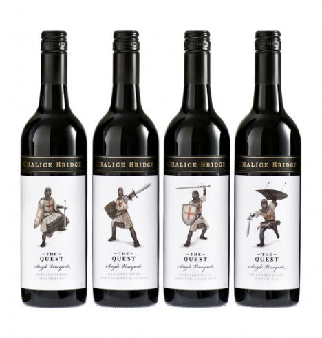
(images via: studio lost and found)
What could better serve as a visual for a wine called ‘Quest’ than a series of knights in jaunty poses? Made by a winery called Chalice Bridge, the limited release range of wines represents ‘the Holy Grail of winemaking’. Tokyo-based illustrator Skye Ogden provided the illustrations.Rabbit Children CD Package by Brian Danaher
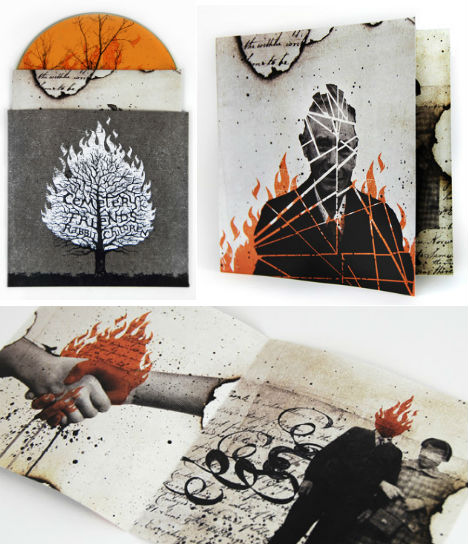
(images via: brian danaher)
CD packaging like this recalls the medium’s heyday, when the case and insert were often as eagerly anticipated as the music itself. Brian Danaher designed this limited edition letterpress printed packaging for Rabbit Children’s EP ‘Cemetery Friends’, saying, “The packaging helped create awareness for the new release by standing out from the generic CD comps and digital download codes typically sent by most labels.”Kraken Rum Media Kit
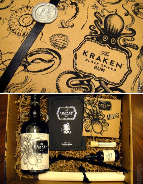
(images via: the dieline)
First of all, this rum is called ‘The Kraken’, giving it automatic awesome points. Second, it’s got an amazingly illustrated label. But take a look at the press package certain lucky members of the media received as part of the rum’s promotion. Packaging blog The Dieline received this box from Proximo Spirits, which is set up as a “proof” kit with each included element offering evidence that the mythical Kraken sea monster really does exist.Cerveceria Sagrada
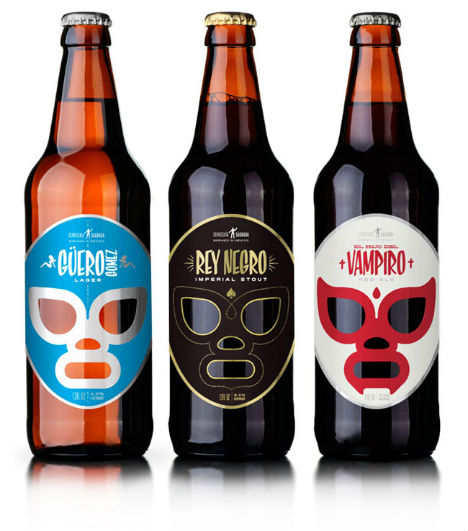
(images via: packaging of the world)
Designer José Guízar drew inspiration from ‘kitschy’ Lucha Libre, one of the most iconic symbols of Mexican pop culture, for this series of Mexican beers.“The whole concept behind the brand and packaging is inspired by the golden era of lucha in the 1950′s, when movie heroes were not Superman or the X-Men — but El Santo and his wingmen, who fought creepy monsters driving a silver ’52 Alfa Romeo with surf music on the background. The variety of styles are named after fictional characters also inspired by the vintage lucha style; “Black King” Imperial Stout, “Blond Gomez” Lager and “The Vampire’s Son” Red Ale.”
Greenpharma by Grupo Habermas
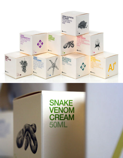
(images via: grupo habermas)
If you’re going to give a product a cool name like Snake Venom Cream, you’d be remiss not to put an image of a snake on the package. Grupo Habermas helps natural cosmetic line Greenpharma strengthen its brand with simple and elegant illustrations, paired with embossed text in bold colors.Fruta del Diablo Salsa by Moxie Sozo
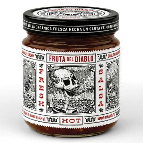
(images via: moxie sozo)
Moxie Sozo gives an unknown brand a whole lot of shelf presence with this strikingly illustrated packaging. “By using hand-drawn illustrations inspired by the woodcuts of Mexican artist Jose Guadalupe Posada, we were able to lend authenticity to the salsa while reinforcing the product’s heritage in traditional Mexican cuisine.”Bella Vie Wine
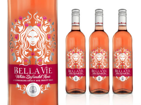
(images via: packaging of the world)
A ‘refreshingly sweet and fruity’ wine called Bella Vie gets an uber-feminine look in this packaging by Ziggurat Brands, marketed toward women who aren’t exactly wine-savvy.“Girls Just Wanna Have Fun’! What they don’t necessarily want is to know all about the provenance of wine, the complexity of flavour, all of that flowery, fruity nonsense. It’s Friday night, everyone’s round for a pizza, crack open a bottle or three and enjoy…Treasury Wines asked us to develop abrand of rose designed for young women – a market that has very little interest in traditional wine language, codes or cues. ‘Bella Vie’ is bright, bold and simply, unashamedly about having a goodtime all the time.”
MLK by Depot WPF Branding Agency
(images via: depotwpf.ru)
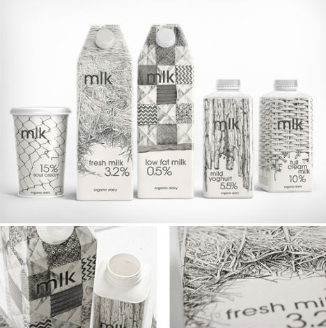
Modern and minimalist, this definitely isn’t your typical big-brand dairy line – and that’s exactly what Depot WPF Branding Agency of Russia was going for in the packaging for MLK. The illustrated images on the packaging were drawn from photos of the actual farm on which the milk is produced.“As for the illustrations, we used natural farming patterns – a family farm, where the products are produced in a traditional way. Illustrations are hand-made (with a pencil) which enables to stress the hand-made production process.”
Origin Coffee by A-Side Studio
(images via: the dieline)
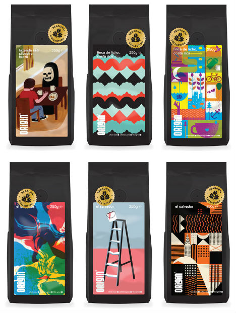
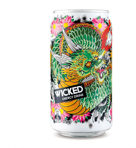
The illustrations commissioned for the labeling of Origin Coffee aren’t just pretty pictures to peer at in the grocery store. These artist-designed works, curated by A-Side Studio, form a traveling exhibition which accompanies Cornwall, England’s Origin Coffee to tasting events.Wicked Energy Drink by Kian Forreal
0 comments:
Post a Comment