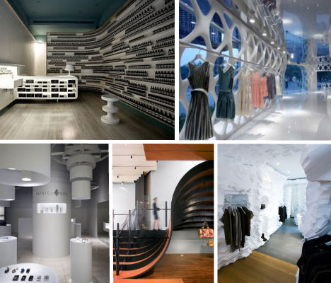
They look like modern art galleries or nightclubs, with space-age displays and unbelievably
imaginative use of the most unexpected materials. Retail store design is more competitive than ever, and stores that want to stand out have to delve beyond merely showing off their wares. Even if you’re not drawn in by clever and creative storefronts or dazzling interactive displays, a glimpse of one of these 14 incredible interior designs might just hook you into opening your wallet. See 12 more sustainability-focused designs at WebEcoist.
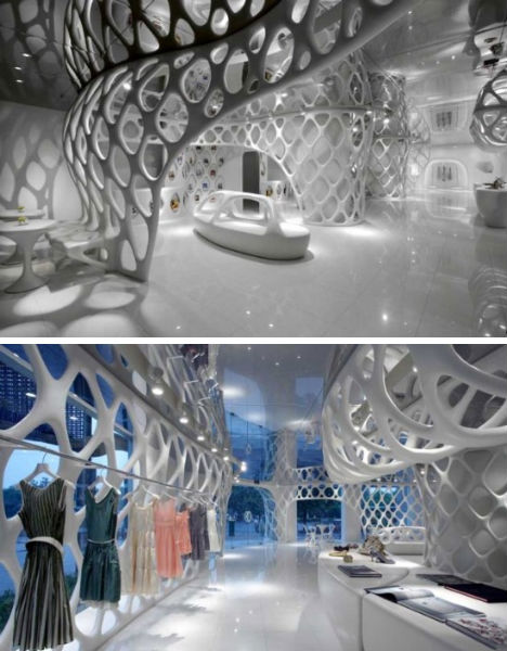
The Romanticism Shop, Hangzhou
(images via: decodir.com)
The owners of ‘Romanticism’, a clothing store in Hangzhou, China, wanted an interior that no one could copy. They got that and more with this incredible ultramodern basketweave design by SAKO Architects, which begins with a white mesh ‘skin’ outside the store entrance and continues through the interior space, forming walls, benches and other architectural elements. While you can’t help but gape at the strange beauty of the space itself, the all-white design removes all distractions from the shop’s colorful clothing and accessories.Podium 1, Paris
(images via: a212.com)
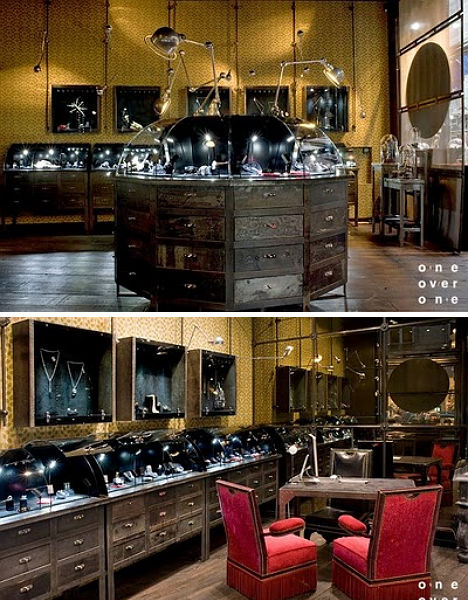
Step through the glossy black entrance of Podium 1 in Paris and you’ll be greeted by weathered wood, gleaming chrome, ornate armoires and golden wallpaper in an antique print. Moscow-based design firm One Over One has infused this purveyor of fine jewelry with a sort of eccentric madcap luxury that enhances but doesn’t eclipse the shop’s wares.Nike Bowery Stadium, NYC
(images via: paper mag)
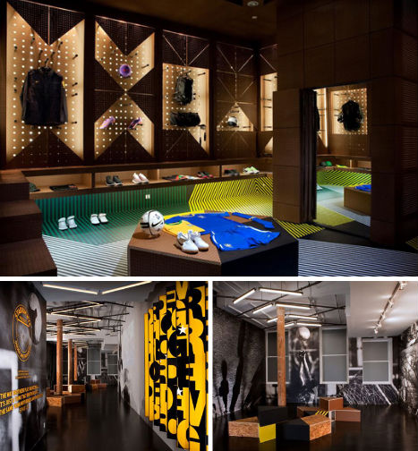
World Cup fans with tastes that preclude hitting up the neighborhood dive bar to watch the games got a special treat in Nike’s STADIUM NYC, a visually engaging venue that is described by Paper Mag as “part gallery space, retail space, and generally sporty hangspot.” Designed by Rafael de Cardenas, the space has a basement that’s an actual locker room made modern and inviting with bright colors and patterns.Oh Wow Book Club
(images via: oh-wow.com)
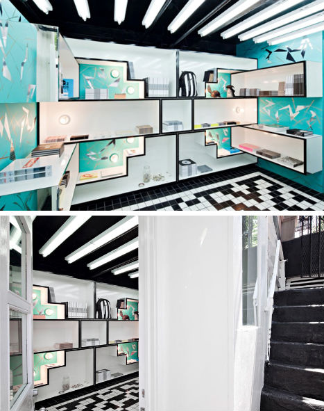
Well, if you’re going to name your shop the ‘Oh Wow Book Club’, perhaps having an interior that makes people exclaim ‘Oh, wow!’ when they walk in is a prerequisite. This starkly geometric space – also designed by Rafael de Cardenas – was inspired by the patterns found on Navajo blankets, in black and white with accents of robin’s egg blue.The Undercover Shop, Japan
(images via: the hundreds)
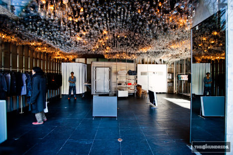
There’s simply no way for any other element in Japan’s Undercover Shop to compete when the ceiling is this eye-catching. The installation, made up of thousands of glass spheres and cylinders, takes on an ethereal glow when just a few of the bulbs are lit.Snarkitecture Richard Chai Pop-Up Store
(images via: design boom)
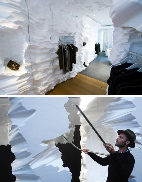
How do you make the biggest impact possible on a tiny budget? If you’ve got the eccentric proclivities of design firm Snarkitecture, you carve the entire store out of massive blocks of white architectural foam. The Brooklyn-based designers carved out the interior of this Richard Chai pop-up store by hand with a hot wire cutter, creating what looks like a polar landscape inside a shipping container.Patrick Cox, Tokyo
(images via: contemporist)
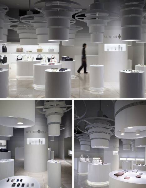
The all-white Patrick Cox store in Tokyo looks positively space-age with its graduated white columns, shining light on wares like handbags and wallets. The space was designed by local architect Chikara Ohno, who says “the pendant fixtures cut the void and shape the space. Pathways in the shop seem to meander beneath a canopy formed by the largest of the drum shades.”BAPE Los Angeles
(images via: high snobiety)
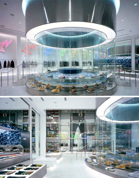
LA’s short-lived BAPE (A Bathing Ape) store on Melrose Avenue was an interesting site for design enthusiasts while it lasted. The main attraction, architecturally speaking, was a huge display column in the center of the store featuring a parade of brightly colored shoes on a conveyor belt.Kymyka Shoe Store, Netherlands
(images via: the cool hunter)
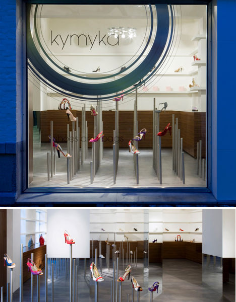
Designed by Maurice Mentjens, the Kymyka Store in Maastricht, Netherlands takes an unusual tact for displaying its collection of designer shoes from brands like Stella McCartney and Yves Saint Laurent. Like a sculptural object, each shoe is given its own steel display pole.Vila Sofa, Amsterdam
(images via: best house design)
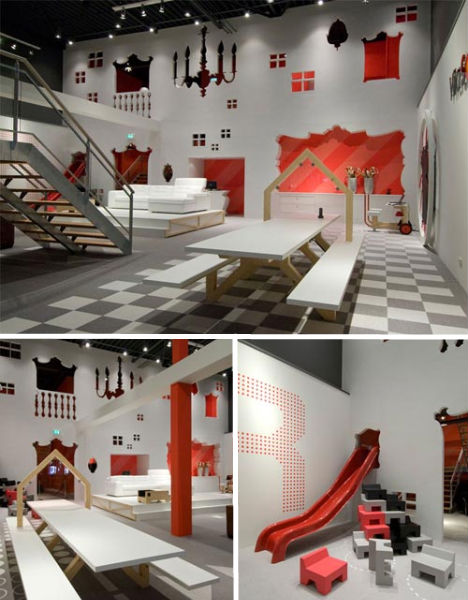
Playful cutouts and a limited color palette characterize the Vila Sofa furniture store in Amsterdam, designed by Tjep. Large graphics of home accents like mirrors, windows and chandeliers punctuate the space while the warehouse unfolds like an aesthete’s playground, reminiscent of a slightly higher-end IKEA.Aesop, Sydney
(images via: veryverybeautiful.it)
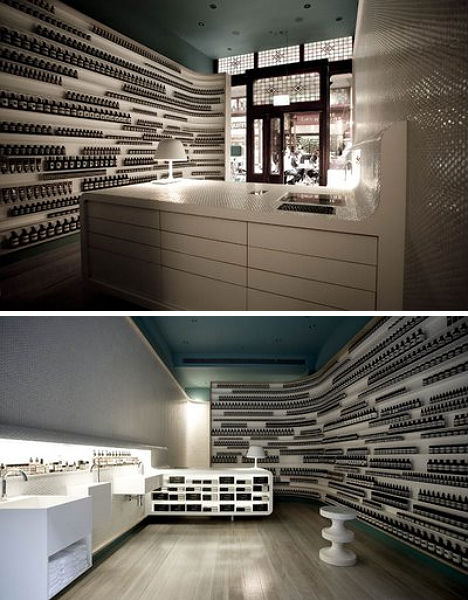
Every Aesop store is slightly different, but all of them place the emphasis on their strongest selling point: the design of their own product packaging. The purveyor of botanical skin care products lines up minimalist amber glass bottles with white labels in simple but artistic configurations. In the Sydney store, white porcelain provides an understated but elegant backdrop for the products.Longchamp’s La Maison Unique, NYC
(images via: heatherwick studio)
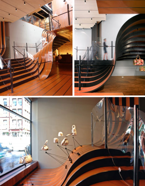
A sweeping curvature of ribbon-like steel stairs makes Longchamp’s global flagship store in Manhattan utterly unforgettable. For ‘La Maison Unique’, design firm Heatherwick Studio spent six months coaxing hot-rolled steel into an artificial landscape draped from the ground floor up three additional levels. Movable magnetic lights and display stands attach to the stairs themselves, while transparent balustrades made with aerospace windscreen technology keep the focus on the shape of the steel.
L’Eclaireur, Paris
(images via: dezeen)
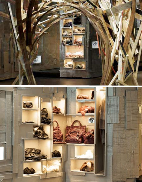
Belgian artist Arne Quinze gave Paris’ L’Eclaireur shop a whole new look using mostly scrap materials. Various pieces of wood and metal – from construction leftovers to printer plates – were painted a uniform silver for an eclectic but finished result that shimmers under built-in lighting.Monki, Oslo
(images via: play me design)
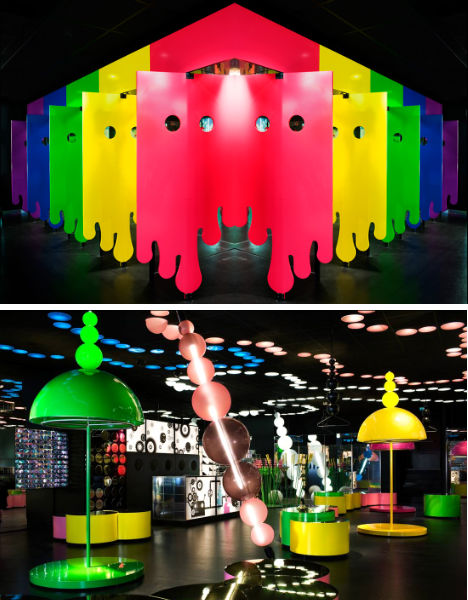
Monki, a Swedish clothing brand, sets every one of its stores apart with a unique design, and this particular location in Oslo is definitely different. Looking more like a nightclub than a retail shop, the design features strung spheres reminiscent of beads on a necklace in acid brights and soft pinks, all against a backdrop of black. Seen here before any merchandise was added, the design is all eye candy.Source
0 comments:
Post a Comment