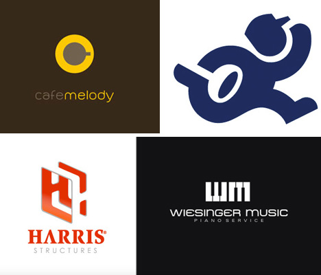
What makes a logo really pop? Clever use of negative space. Using “whitespace” as an active
part of the design doesn’t just create visual harmony – it can also produce optical illusions that elevate this vital element of brand identity from forgettable to iconic. Adept incorporation of negative space into a logo helps designers make the maximum visual impact with the simplest elements possible.
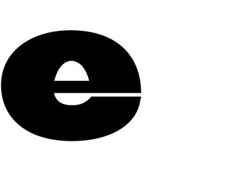
Egg-n-Spoon
(image via: Thoughtful)
At first glance, this “e” isn’t all that interesting. But consider that the logo was created for a courier service called “Egg-in-Spoon” – with the tagline, “Sameday Couriers – Speed with Care” – and take another look. The reader comments on the design firm’s blog enhance the fun: “i hope no-one poaches it…” “We were thinking eggs-actly the same thing… :)” “Did you have to scramble around for that idea?”The Brand Union
(image via: Designer Profile Online)
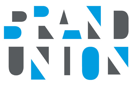
Typography design based entirely on negative space can get messy fast, but somehow this design for The Brand Union works. Careful color choice and editing of the negative space in this logo helps the words stand out, so it doesn’t look like a confusing jumble of shapes.Truce
(image via: TurnerDuckworth.com)
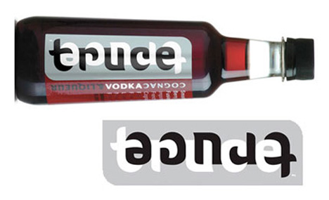
It’s somewhere in between an excellent use of negative space and an ambigram – using a font to spell the word “truce” that fits within itself when flipped upside-down. Designed by Turner Duckworth, who have also worked with Coca-Cola and Amazon.com.Bermuda Aquarium
(image via: LogoPond)
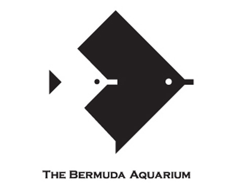
It’s just a concept, developed by Schuster for the Bermuda Aquarium, but perhaps they should consider a change. This design is considerably sleeker, more modern and far more eye-catching than the one they’re currently using. Exceedingly simple shapes are all that’s needed to convey an image of fish swimming side-by-side.Café Melody
(image via: LogoFaves.com)
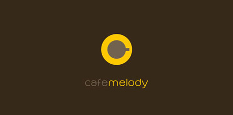
Designed by Jure Klaric for a lounge bar in Croatia, this logo gets more effective the longer you look at it. Not only do the two simple shapes make a somewhat stylized “C” for “café”, they also form a coffee cup on a saucer as seen from above – and the shape of a volume button.Fed-Ex
(image via: FedEx.com)
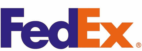
It might just be one of the most famous examples of using negative space in logo design, but it’s also among the most subtle. Fed-Ex’s little white arrow, formed by the space between the E and the X, is a detail that many people don’t even notice, but it’s appreciated by fans of good logo design. In an interview with TheSneeze.com, designer Lindon Leader of Leader Creative explained its inclusion.“An arrow, in and of itself, is one of the most mundane graphic devices in visual communications. Truly, there is nothing unique or particularly strategic (marketing-wise) in using an arrow as a brand identifier… The power of the hidden arrow is simply that it is a hidden bonus. Importantly, not ‘getting the punch line’ by not seeing the arrow, does not reduce the impact of the logo’s essential communication.”
8 Fish
(image via: LogoGallery.net)
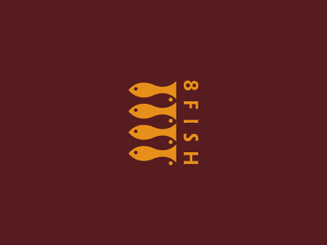
Using images of eight fish to illustrate the company’s name would be far too busy for a logo design… if it weren’t as well done as this. Designer Jerrod Ames managed to fit them all into a logo that is still crisp and minimalist.Ogden Plumbing
(image via: 38one.com)
Designer Matt Everson says, ““Ogden’s core competency is great service, so I was determined to create something friendly and personal. I focused almost exclusively on the human figure as I knew this could illustrate many things (response, strength, personal service, etc. In messing around with wavy, water-like shapes I developed the running plumber image and saw the opportunity to incorporate the plunger.”Girl Scouts of America
(image via: GoodLogo.com)
Another famous and easily recognizable logo utilizing negative space is that of Girl Scouts of America. Designed in 1978 by Saul Bass, the logo that has adorned many a box of delicious cookies features three feminine faces in profile. Bass also designed the logos of AT&T, United Airlines and Bell Telephone as well as titles for movies like Alfred Hitchcock’s “Psycho”.Hartford Whalers
(image via: Wikipedia)
Just two graphic elements plus the white negative space around them combined to create an incredibly simple and evocative logo for hockey team The Hartford Whalers. Formed between the ‘W’ and the shape of a whale’s tail is the ‘H’ standing for ‘Hartford’. The logo, designed by Peter Good, was updated in 1992 to incorporate a silver background.Yoga Australia
(image via: TheLogoMix.com)
What appears, at first, to be a simple image of a woman doing yoga reveals itself after taking a closer look at the white space created between the woman’s arm and leg. It forms a rough approximation of the shape of Australia, without distorting the figure of the woman.Harris Structures
(image via: DesignDosage)
In this logo, two ‘H’s – including one formed by negative space – come together to form a structure as seen from an angle, perfect for a company called ‘Harris Structures’. Designed by Ahab Nimry of St. Louis.Guild of Food Writers

(image via: DavidAirey.com)
Like a classic optical illusion, some people will see this logo as a certain object and to others, it is something else altogether. A pen nib, or a spoon? Look carefully, and you’ll see it’s both. Logo design doesn’t get much more succinct than this, created for the Guild of Food Writers by top UK design firm 300million.ED ‘Elettrodomestici’
(image via: 38one.com)
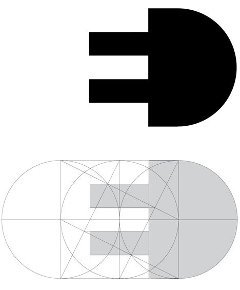
Perhaps it’s just a grand coincidence that the letters ‘E’ and ‘D’, which stand for Elettrodomestici (or ‘household electric appliances’ in English), happen to form the shape of a plug. But what could really explain the stark mathematical perfection of this logo by Gianni Bortolotti, other than artistic genius?Invisible Children
(image via: LogoPond.com)
Identified by the designer as “just practice”, this redesign idea for an effort to help children affected by war in Northern Uganda turns the shape of Africa into a child’s foot, with the words ‘Invisible Children’ formed with negative space.Weisinger Music
(image via: LogoPond.com)
No two letters in the alphabet are more perfect for creating a sleek, graphic piano logo than W and M. For a piano shop called ‘Weisinger Music’, a monogram that forms piano keys couldn’t be more harmonious.Microsoft’s ‘Mouse’

(image via: BoingBoing)
It’s the word ‘mouse’. It’s a mouse (as in the animal) with the ‘o’ as its ear. But it’s also the shape of a computer mouse – a clever combination for Microsoft’s “Mouse” awards, formerly known as the “Microsoft Digital Advertising Solutions Creative Awards”.NBC
0 comments:
Post a Comment