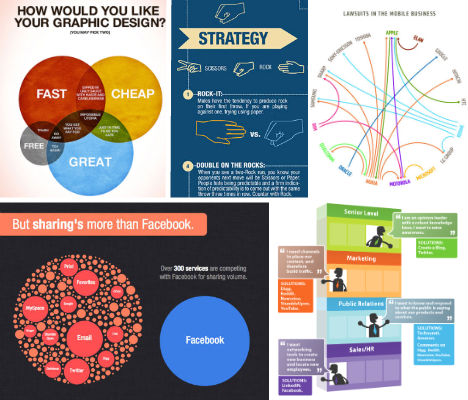
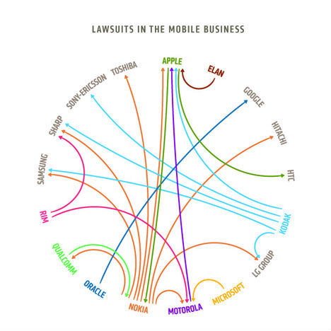
Write out a paragraph explaining how various telecom companies are suing each other,
and it might be hard to grasp just how interconnected all those lawsuits are. But break that same information up into a graphic, and it suddenly becomes clear as day. Infographics make news, scientific data and other information far easier to digest, and these 14 clever examples cover everything from Facebook’s social media takeover to the best way to win ‘rock, paper, scissors’. (Click the images to view a full-sized versions.)
How We Shared Content in 2010

(image via: add this)
This sharp, brand-spanking-new infographic by AddThis shows us just how much we all came to rely on Facebook for sharing information in 2010. Its share of the social media pie grew by 1/3 over 2009, though other services are growing faster: it’s outpaced by Gmail, StumbleUpon, Orkut and even Yahoo Mail.How Would You Like Your Graphic Design?
(image via: colin harman)
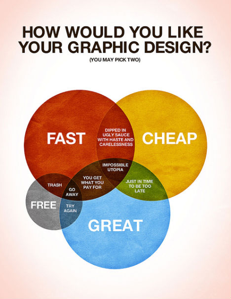
A fun, colorful Venn diagram by Colin Harman makes it easy to see why graphic design that’s fast, cheap and great is “impossible utopia”. At the intersection of fast & great, “you get what you pay for”, but want it great & free? “Try again!”How Coffee Affects the Global Economy
(image via: mint.com)
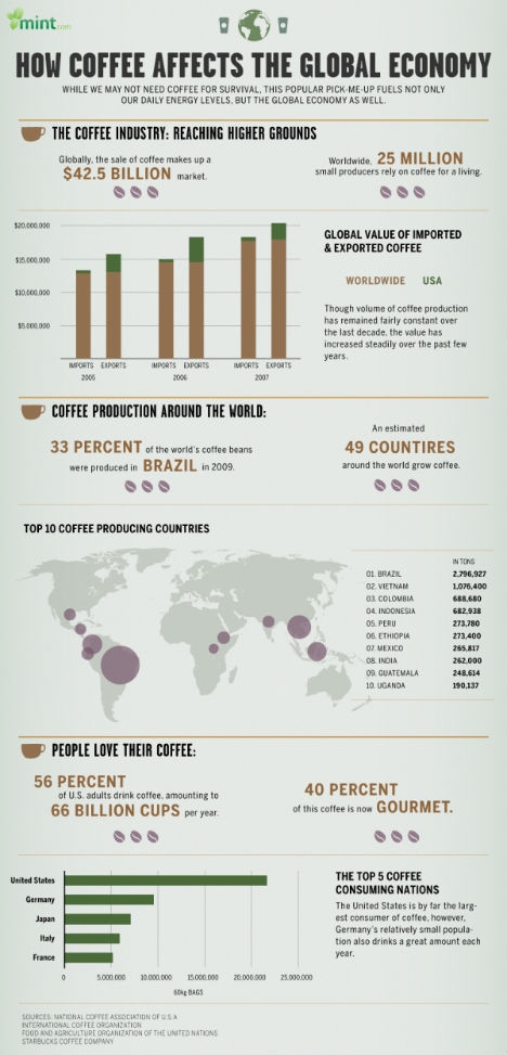
There’s a lot of information about coffee packed into this simple infographic by Mint.com. A quick glance tells us that most of the world’s coffee comes from Brazil, and that despite the reputations of both Italy and France, it’s the U.S. that leads the world in coffee consumption.Building a Company with Social Media
(image via: elliance)
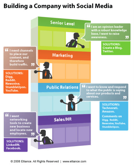
While many infographics contain only partially illustrated jumbles of semi-related content, this crisp representation of a businessperson’s social media needs is the epitome of what an infographic should be. It’s clear and concise, making the information easier to digest with eye-catching visuals.Pink Floyd 1960-2000
(image via: 802.11)
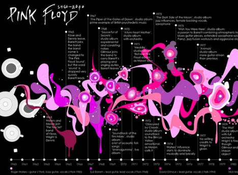
Have you ever seen a more psychedelic timeline that’s so well-suited to its subject? Flickr user 802.11 designed this eye-catching graphic history of the band Pink Floyd from the first meeting of future bandmates in 1963 to the release of the album ‘Is There Anybody Out There? The Wall Live’ in 2000.Top Jobs for Critical Thinking
(image via: thinkwatson)
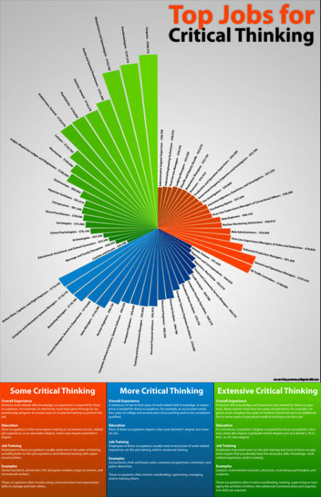
Fanning out in an asymmetrical spiral, the main graphic in this design by ThinkWatson shows us that it pays to be a critical thinker. The ‘Top Jobs for Critical Thinking’ are arranged in red, blue and green in order of the amount of critical thinking required, starting with Administrative Support Supervisor with an estimated salary of $48,700 a year and ending with Surgeons at $206,770.Where is Everyone?
(image via: design you trust)
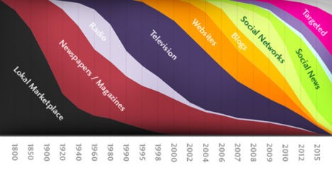
Between 1800 and 1900, the sole sources of news and information were the local marketplace and newspapers. Radio and television slowly crept in over a century, but by 2000, our choices exploded, as illustrated in this infographic published by Design You Trust.Facebook Privacy: A Bewildering Tangle of Options
(image via: nytimes)
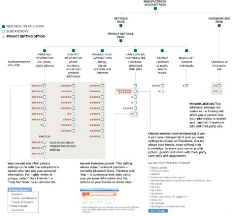
The New York Times published this flow chart of Facebook’s 170 privacy options, from how to filter your personal information to controlling how your data is used by third party companies. It also depicts the disturbing growth of the social media empire’s privacy policy, which has gone from 1,004 words in 2005 to 5,830 words in 2010.Lawsuits in the Mobile Business
(image via: design language)
Who’s suing whom in the mobile business? Design Language lays it all out with this clean and simple infographic, which proves that Nokia’s got a lot of beef and Apple has a lot of problems.The Colors of the Web
(image via: colourlovers)
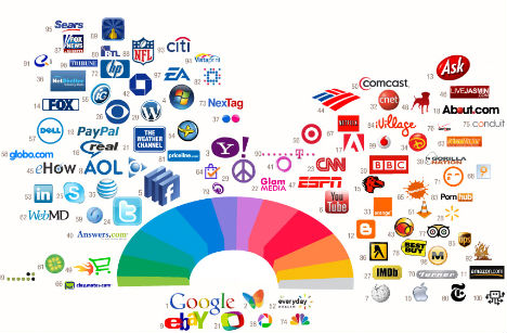
What are the most powerful colors in the world? According to this infographic by Colour Lovers, when it comes to logos and web design, the world’s biggest companies are feeling blue. Interestingly, top brands within the same categories like social media, blogging and geotagging tend to use similar color palettes.Where are the World’s Small Arms?
(image via: fast company)
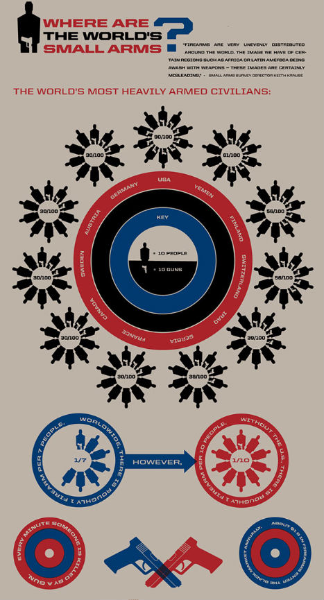
This infographic shows that when it comes to guns, nobody tops the good old U.S. of A., where there are an incredible 9 guns for every 10 people. Only Yemen comes close, with 6.How to Win Rock, Paper, Scissors
(image via: chacha)
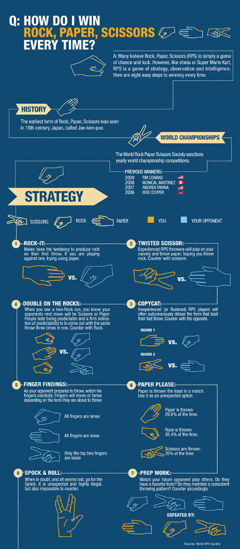
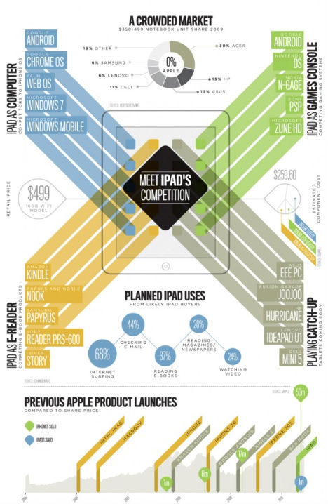
Want to know how you can beat the game rock, paper, scissors every time? Just study this amusing infographic by ChaCha, which recommends a series of choices based partially on the sex of your opponent.Meet iPad’s Competition
(image via: section design)
The iPad debuted in 2010 as a virtual all-in-one gadget, offering internet surfing, e-mail, video, games and e-books in a compact tablet form. So just how many brands did the iPad effect? This graphic lays it all out, showing the iPad’s competition in various areas of usage.Infographic Airplane

Ever seen an infographic this big before? Kulula Airlines printed one of its planes with ‘Flying 101′, labeling the parts of the plane with funny comments like “loo (or mile-high club initiation chamber)” and “rudder (the steering thingy)”
Source
0 comments:
Post a Comment