A well-designed logo is timeless, simple, memorable, versatile and appropriate.
But then there are the hideous, the bizarre, the unreadable and the offensive (whether due to unintended double entendres or Comic Sans). The things that make a logo truly awful aren’t easy to define, but you know a bad one when you see it – clip art, raster graphics, unrelated imagery and poor choices in typeface. Except in the hands of a truly exceptional designer, these 10 mistakes will cripple any corporate branding strategy.
Uninspired Fonts

(images via: good people bad fonts)
For the love of good design, please don’t ever use Papyrus, Curlz MT or – heaven forbid – Comic Sans in a logo. Ever. These fonts have earned the vitriol of designers around the world with good reason; while they may have their place in personal communication between schoolteachers, they don’t belong in graphic design of any kind, let alone the most visible piece of branding your company has. Overused and cutesy fonts, especially of the widely available ‘free’ variety, do absolutely nothing to add to a brand’s identity. They scream ‘amateur designer’ and make companies look unprofessional.Stock Art

(image via: thetreedoctor)
On a similar note, stock clip art that can be acquired for free on the internet or on very cheap CD-ROMs can’t possibly set your company apart. It’s not just that the designs themselves aren’t usually great quality; if potential customers note the same little sketch of a house on your company letterhead that they saw earlier on an informational poster in their dentist’s office, they’re not going to take you seriously.Photoshop Filters & Effects
(image via: the club doctor, fierce photography)
Outer glow, inner glow, drop shadow, highlights, gradients, bevels – all of these effects have their place. Used sparingly by a good designer – as in the latest Apple logo – they add a bit of visual interest. Piled on, they make logos messy and harder to read. Technically, Photoshop and other image editing programs shouldn’t really be involved in logo design at all (more on that later), but things like ‘lens flare’ just don’t translate well in what is supposed to be bold, graphic imagery.Inappropriate Imagery
(images via: checkpoint, von brandis)
Graphics that are vague or totally disconnected from what a company is all about can kill a logo’s memorability. What, for example, does a dolphin have to do with a security firm? How is an abstract art piece that sort of almost barely resembles a computer going to remind people of your software company? The graphics, color and mood associated with a logo should have some association what the company does – i.e., don’t use primary colors and a goofy typeface for a legal firm. But don’t take that too literally – a car company doesn’t need to have a car shape in its logo, for instance.Really, Really Inappropriate Imagery

(images via: bad logo project)
Not everyone looks at images like those above and immediately sees phallic symbols, sexual innuendo or four-letter words. But in the interest of not becoming a tired Beavis and Butthead joke, it might be best to take a good look at the graphics in your logo to ensure that they don’t resemble anything offensive or inappropriate.Fuzzy Graphics

(images via: vector-conversions)
Being good at fine art does not make one good at logo design; an image from, say, a watercolor painting or pencil sketch will more than likely look muddy, complicated and unmemorable when used in a logo. The same typically goes for photography. Does that mean effective logos all have to be spare, bold and modern? No. But it certainly helps.The bigger mistake, in this case, is using raster rather than vector images. Raster images are made up of tiny pixels, and get extremely fuzzy when blown up. Vector images, on the other hand, are scalable, so they look good at any size. Programs that don’t deal with vector images – like Photoshop – shouldn’t be used to create logos.
Reliance on Color for Effect

(images via: conjurelimited)
One of the best tests for logo design is to put it in black and white. If it’s still crisp and readable, even on a small scale or printed in reverse (i.e. a white design on a black background), it’s a good logo – if not, try again. For optimal results, many designers recommend creating a logo in grayscale first, then translating it to color.The Corporate Swoosh
(images via: capital one, kraft, blow at life)
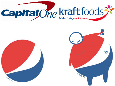
After over a century of ineffective, constantly changing logos, Pepsi has finally resorted to the corporate swoosh – the bland, meaningless decorative flourish that says “I give up”. The corporate swoosh is safe yet completely disconnected from brand identity, except in the case of Nike, who truly made it theirs. In Pepsi’s case, the uninspired swoosh-in-a-circle even takes on a rather unfortunate connotation (as illustrated by a graphic designer). A swoosh doesn’t make it good design. It’s just lazy.Unnecessary Complexity

(images via: seattle pi, salute to soda, desoto, village sports)
For every corporate swoosh there’s a logo that goes way too far in the other direction, with way too much going on. Not only do overly complex logos tend to look terrible on signage and other places that logos are commonly used, but they are simply too muddy to make much of an impact. And when they’re reproduced on a small scale, they become illegible. The original Starbucks logo, the new Sunkist logo, and far too many sports-related logos fall into this category.Unreadable Jumbles
0 comments:
Post a Comment